(art posted on 11/19/2022)
While I have animated stuff in the past, Sunken Laundromat was my first attempt at a fully animated scene. It ended up taking a little over 40 hours total, done over the span of 17 days, which was a lot longer than I expected. Making these looping animated backgrounds really tests your patience, and I struggled a lot with getting this one completed.
Before we get into the analysis, I’d also like to mention that my art critique skills are pretty sub-par, since I haven’t really analyzed art in the past. They’ll get better as I post more of these, but for now you’ll have to excuse my lack of knowledge.
Structure and Composition
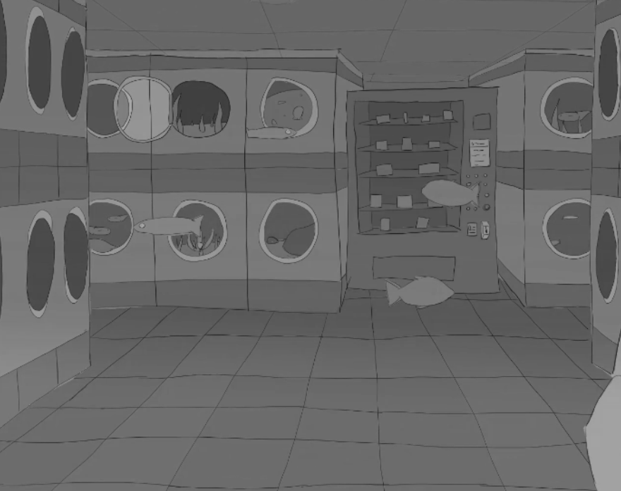
To sell the underwater look, I drew every single line to slightly wave and distort, simulating the refraction of light. This means that each line had to be given 4 frames. While it does create the look that I was going for, there are a few major drawbacks to this approach.

The first and most obvious issue is that it takes a very long time to make. Just the lines alone took over 8 hours to draw, so it’s hard to call it an efficient use of time. Another major disadvantage to this way of portraying water is that it scales poorly. Towards the later stages of drawing, I found myself unable to add the details that I wanted to add due to the difficult process of drawing everything 4 times in a wavy motion. This is the reason why the products in the vending machine are completely blank or why the stuff in the washing machines at the back do not have the distortion effect at all.
Despite the flaws, I’m still unsure how I could’ve approached the distortion differently. It’s possible to create the underwater effect in after effects without having to redraw anything, but the feel of it would be completely different. Something that I was going for was a hand-drawn look where there’s a ton of imperfections and inconsistencies, which would be completely lost if I were to replace it with VFX.
The one thing that I would’ve changed if I could redo it were to put more effort into being organized, since keeping track of all of the wavy lines across multiple layers made the lines take at least 30% longer to draw than they should’ve.
Looking back, the proper organization is actually very simple as well. To start, I could categorize everything into either fish, foreground, floor, background, and behind-background (inside the washing machines). From there, working on each category in their own separate project would’ve made the process far smoother since I wouldn’t have to worry about unrelated layer clutter. If I had done this, I may even have been able to add some of the finer details that I mentioned earlier.
As for how the scene is composed, the layout is super simple with just a bunch of washing machines lined up in 1 point perspective. The reason I chose something so simple is because I originally planned to include a wider variety of aquatic life, especially plants, but I wasn’t able to get it to look right due to lack of knowledge and understanding of them. I would absolutely benefit from going to an aquarium.

I still think the fish are enough to make the scene feel populated, but it could’ve felt much more alive if the fish had objects to swim around and things to interact with.
Colors
In my opinion, my choice of colors are the biggest weakness for the scene as a whole. To start, pretty much everything is blue. This was originally supposed to be balanced out by having aquatic plant life, but I didn’t change anything after discarding that idea, leaving the scene kinda bland in color. A funny side effect of everything being blue is that the vending machine sticks out, being the only non-blue thing in the scene. One of my artist friends actually asked me if there was any significance to the vending machine since they thought I was trying to call attention to it.
Another element to color that was lacking is my variety of values. Let’s look at an image of it in grayscale:
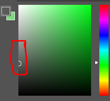
Something that you’ll notice is that everything falls into a small section of midtone values. This makes the entire scene feel flat since there isn’t anything that’s very light or dark. I should also mention that I didn’t draw any shading/lighting, which are things that would both create opportunities to use a wider range of values and give the scene more depth.
It certainly wouldn’t be easy, but I imagine a more skilled artist would’ve had lighting that gets partially obstructed as fish pass by, which would make the space feel much more 3-dimensional.
Anyways, that’s it for this entry of self-critique. Again, I’m still a bit of a noob and absolutely suck at criticizing art, so if you have anything in mind that I haven’t mentioned, it’d be huge if you left a comment and let me know your thoughts. With that said, thanks for reading!
I have been playing at 639jili for a few weeks and this seem to be the kind of website I was looking for. With the game I prefer and super easy to get used to. This is my invite to try 639jili
Yo heard about 54bets, looks great for placing bets. Not as many choices as others, but pretty good. I would recomend you to try it, good looking and fully functional. Try it here 54bets
KM88bet is on my radar lately. I tried em, and its a functional platform for place your bets, nothing outstanding, but it get the work done. I encourage you to try km88bet to have a good experience.
levothyroxine medication
levothyroxine medication
hello world
hello world
88fcbet is pretty rad for football betting especially. If you love football, this is your jam! Check it out now 88fcbet!
Yo! 79kingbet has good promos and the interface is alright. Give it a look 79kingbet. It might just be your lucky spot. Plus, the support is decent.
I am telling you guys, 68vin is a solid option. I’ve been playing there for a while and the experience has been good. Time to get those wins 68vin!
I’ve been using 6745bet1 and I am pretty impressed with the odds. Very high indeed 6745bet1
Philippines, represent! Thinking to try 234winph tonight, wanna see if it’s any good. Let’s get lucky tonight, check the link here: 234winph
Thinking of giving 02bet a try. The site looks good, but anyone has already tried it? I would love to know if you had any good wins here: 02bet
Smart bankroll management is key, even with tempting platforms! Seeing sites prioritize security like 68wim game is reassuring – KYC & encryption are vital. Play responsibly, folks!
[7490]PHJL Login & Register: Experience the Best PHJL Slot Casino in the Philippines. Fast PHJL Casino Login & Official PHJL App Download for Non-Stop Gaming! Join PHJL, the top PHJL slot casino in the Philippines! Experience fast PHJL casino login & easy PHJL register. Secure the official PHJL app download for non-stop gaming action today! visit: phjl
Heard about alibaba88 slot game on bet88goldenhour.com. Gave it a spin and it’s actually kinda fun! Pretty colorful and the bonus rounds kept me hooked. Give it a try!: alibaba88 slot game
Yo, betwinnercd is legit. I’ve been hitting some wins there lately. Odds are decent and withdrawals were surprisingly quick. Give it a shot if you’re looking for a new spot. More info here: betwinnercd
Decided to give okkingbet a shot. Heard some good things, hope it lives up to the hype! Wish me luck. Click there: okkingbet
Finally managed the PGVIPLogin! Had a bit of trouble finding the right link at first, but now I’m in. Let’s see what this VIP thing is all about. Worth a look.Try it: pgviplogin
LuckyPkr888’s been treating me alright so far. Decent poker action, and the software runs smoothly. Nothing crazy, but a reliable option. Give it a go: luckypkr888
So, I tried JK4Casino. The registration was quick and easy, which is a big win in my book. The games are pretty standard, but they seem fair enough. Give it a look: jk4casino
PHL777 Online Casino Philippines: Easy Login, Register & App Download for the Best Slot Games Experience. Join PHL777 Online Casino Philippines for the best PHL777 slot games! Quick PHL777 login, easy register & secure app download. Play now and experience big wins! visit: phl777
panalo99 https://www.uspanalo99.net
Y666game, yeah! Jumped in for a quick game last night. Graphics are smooth, gameplay is decent. Need more bonus rounds though But overall, thumbs up From my experience, I’d recommend giving them a shot y666game
Gave 177slotgame a shot. I was pleasantly surprised! They have a solid selection of games, and the site runs smoothly on my phone. I’d recommend giving this one a go with this link 177slotgame.
Alright, so OKVIP78win isn’t bad. It’s got a pretty standard casino layout, but some of the games are a bit more unique. Not a huge fan of the color scheme, but that’s just me. Check it out for yourself okvip78win.
jlboss https://www.jlbossw.net
ph488 https://www.freeph488.com
Someone told me about app7clubs the other day. Sounds kinda fun, like a place to chill and maybe get lucky. Anyone here tried it? Tell me about it!
Yo, check out bubetburundi! Heard some good things about it. Might be the next big thing. Worth a look-see, ya know?
Checked out Bubetmarque. It’s got a unique feel, which I dig. Time to put my chips on the table and hope for a win! Give it a try: bubetmarque
Heard about xsmb truc tiep minh ngoc today, I’ll go check to see what’s up with it! Can’t wait to let you know, come with me, just click here: xsmb truc tiep minh ngoc.
84winph time? I sure believe it is! Will give it a try now that i have the opportunity! Give it a shot for yourself, just click here: 84winph.
baixar7kbetnopc, sounds interesting, let’s give it a shot! Another one for you? You can find out more at: baixar7kbetnopc.
Esportedasorte… If you’re into esports, give this one a look. Could be your lucky day. esportedasorte
8959betlogin – I used it the other day. Not bad for a quick betting session when on the go. Easy access and simple UI. Overall, decent! Just use this link: 8959betlogin
Needed a reliable login portal and ckcbetlogin came through! Quick, easy, and always works. A total lifesaver, especially when you’re in a rush! Details here: ckcbetlogin
Seubet? Okay, sounds interesting. Anyone used them for sports betting? What are the odds like? Giving seubet a try if it’s worth it!
Sprunki Incredibox takes music creation to a whole new level-its intuitive design and expanded sound library are a dream for both casual players and serious composers. Check it out at Sprunki Incredibox!
cannabis delivery service usa and global