Fresh ideas and new interpretations always start with inspiration.
As the design and creative lead for QP2, I’ve had to make a vast amount of decisions. In fact, it’s the most creative decisions that I’ve ever had to make on a single project. In this post, I want to take a look back the things that inspired me and make up the greater experience of QP2.
This is the second in my series of QP2 dev blog posts (the first being on blog.osk.sh). They don’t have to be read in order, but check the other post out if you’d like my perspective from a more technical and game design lens.
Initial Concepts
As mentioned in the first post, there were a few early concepts before we landed on the continuous tower climb in the final cut:
Concept #1 – Multi-Arena System
Players are split evenly between 5 different arenas which each act as their own FFA room. After an arena’s round ends, the best performing players will promote to the next room and the lowest ranking players will fall to the previous. The smaller groups of players speeds up the length of each round, and the skill grouping gives more players a shot at winning.
As the first concept, the Multi-Arena System falls pretty close to what already existed with QP1 with some slight improvements. The idea of having multiple rooms in order of skill actually came from old CS:GO 1v1 community servers. In those servers, you’d have numbered 1v1 arenas and after each round the winners move up and the losers move down.
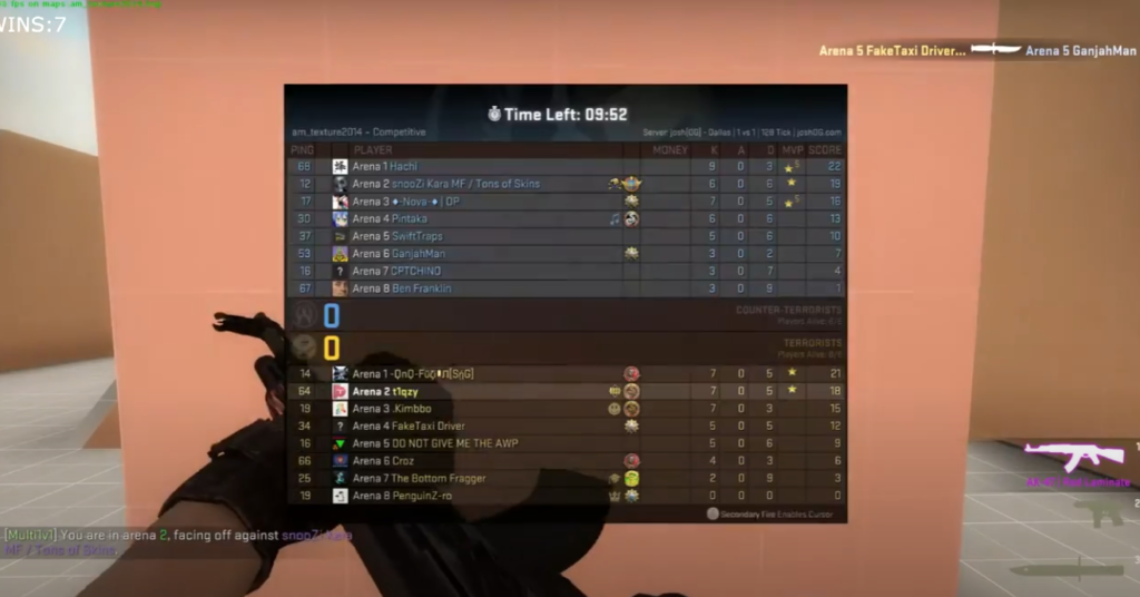
It’s worth noting that this isn’t a particularly unique concept. I can even recall being in high school PE class playing badminton with 6 courts and having the winners move up by 1 court while the losers move down. I remember really enjoying the days when we played like that, since it was just the correct balance of stakes while not being as sweaty as an elimination tournament. This sort of idea is where the concepts for QP2 began.
Another one of the benefits of this system was in theming. Each arena could have a different theme and their own set of backgrounds, music, sfx, and particle effects. The original premise was to go for something that felt similar to Clash Royale arenas.
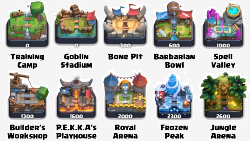
The key idea here is that instead of having a progression where they get cooler or more elaborate as you climb higher, the arenas would just be different from eachother. This would make it fun to discover new arenas while also making sure that even the lower-skill players won’t get hardstuck in some shabby broom closet that constantly reminds them of how bad they are.
Concept #2 – Persistent Tower FFA
Instead of having rounds start and end, the game is a constantly running free-for-all where players can freely drop in or out. The tower is split up into 8 floors where getting a KO moves you up and topping out will revive you on the floor below.
This is where the idea of the environment being a tower began. Towers and floors are nice because it’s easy to represent “above” and “below” in a very literal sense. This version very closely resembled an event minigame from The Hypixel Pit called “Spire”. In this game, getting a kill promotes you while dying respawns you on the floor below.

I used to be a fairly active Pit player, and I remember this being my favorite major event. One of the fun things about it was that even if you weren’t that good, you’d still occasionally have streaks where you steal a few lucky kills and reached a very high floor. The variance and chaos of climbing made it feel much more like a party-style game while still being pure Minecraft PVP (and still able to remain fairly tryhard-friendly).
I’ve also always generally liked the “competitive tower” setting in other works of fiction. For example, Heaven’s Arena from Hunter x Hunter features fighters climbing the tower, with floors acting as a representation of the competitor’s standing.
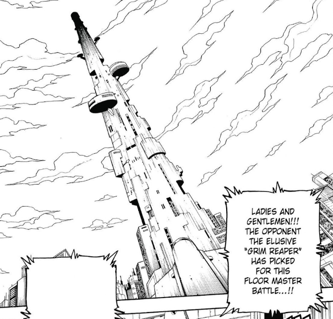
As I mentioned before, it’s definitely the very literal interpretation of climbing and the upper/lower hierarchy that I find appealing. Going up in floor and seeing what new dangerous opponents await is a cool feeling that I found myself wanting to recreate.
Concept #3 – Elevator Battle
Similarly to the previous concept, the game is a constantly running FFA. The player’s board is on an elevator rail and gets powered by sending lines. Targeting is based on the closest opponents to the sender’s altitude. Topping out will send you back to the very bottom to start again.
Concept #3 is the one we ended up going with, but what you might notice that’s changed is the “elevator” theme. The original idea for this actually came from the Yu-Gi-Oh! anime.
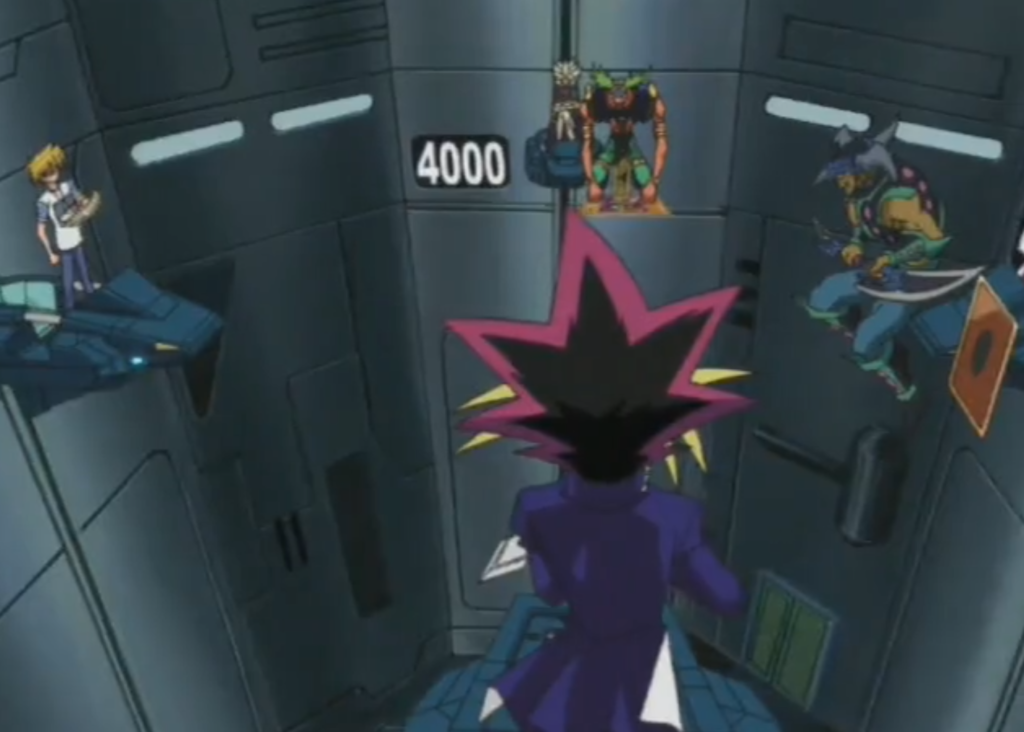
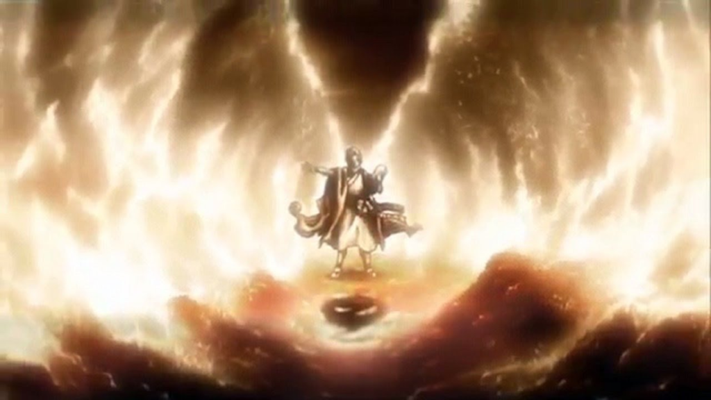
In Yu-Gi-Oh, it was shown as a 4 way duel between the semifinalists of the Battle City tournament to decide their matchup. There’s actually hardly any similarity between my concept and the game they played in Yu-Gi-Oh, but this had been my mental image of what it’d look like from the beginning. The only thing shared is how players are on an elevator that responds to actions taken within the game.
Something worth noting is that I didn’t think about other .io games at all when it came to the early concepts. It’s only by pure coincidence that the final version ended up resembling them quite a lot. When trying to emphasize the “quick” part of Quickplay, a lot of the priorities end up being similar in design to the typical .io style of game, so I ended up coming to similar conclusions without realizing.
Worldbuilding
One of the first questions when building a world for TETR.IO is where the act of stacking blocks even fits into the world. I looked into a lot of different media that centered around abstract games, and in doing so the first major decision appeared. How abstract should this game be?
In this process I looked through many different games. Not only did I look at puzzle games with stories like the Puyo Puyo series, but also any other media that has to integrate a game into a world.
From looking at all of these different worlds, I noticed that you can place them all onto a spectrum between “Abstract” and “Literal”. You can think of this as a measure of how big of a difference there is between the game and it’s impact on the world.
- Abstract: The game that’s being played has basically no relation to the world outside of loose connections like “positive outcome in game = positive outcome in world”.
- Inbetween: The game being played represents specific action(s) in the world.
- Literal: The game itself is a part of the world.
Here’s an example for each of these positions:
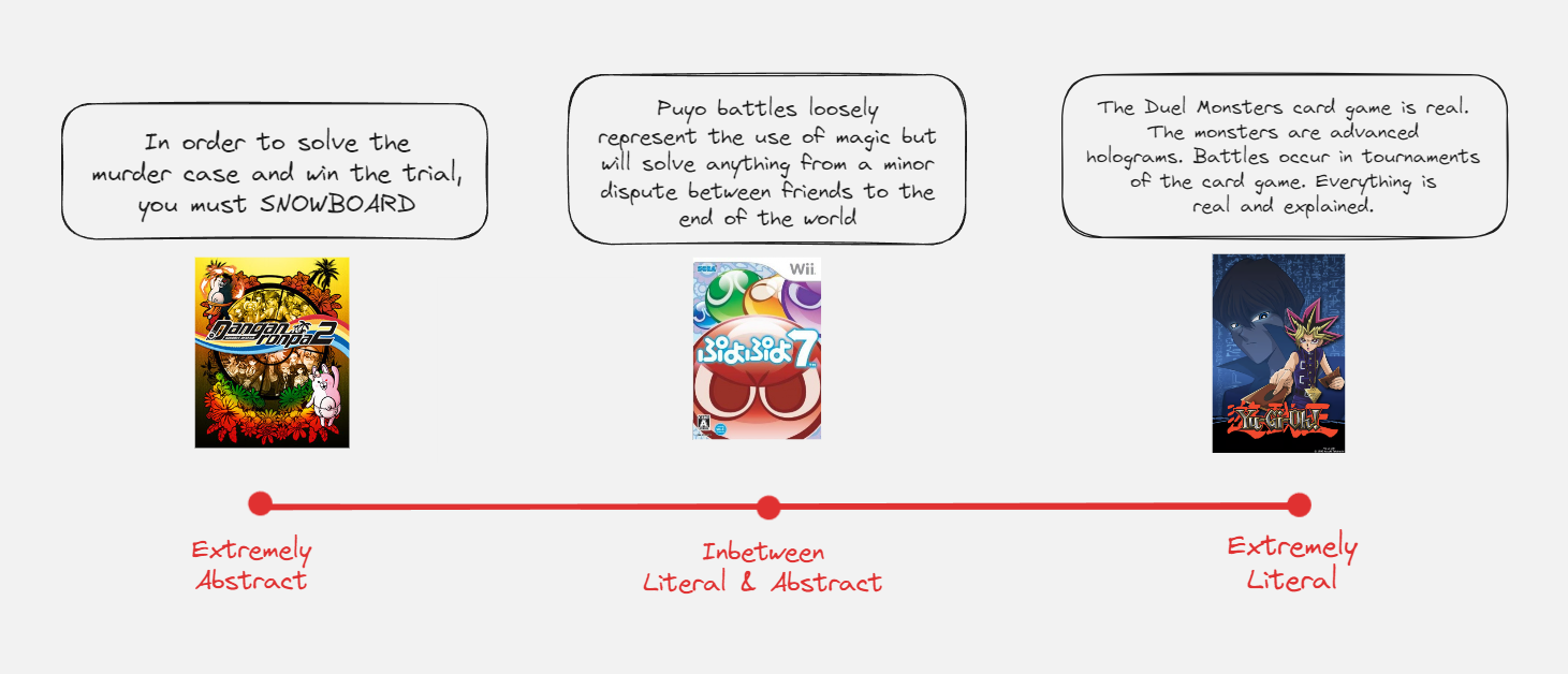
Note: These are only loose placements. I’m aware that Logic Dive is actually supposed to represent thinking and Yu-Gi-Oh still employs abstraction at times, but some leeway was necessary to make this point properly.
Trying to figure out where to place TETR.IO’s world was an incredibly difficult challenge. On one hand I wanted a more serious feeling world that would be suited for a literal interpretation of the game. On the other hand, you lose a lot of freedom by boxing yourself into having to write everything into the world. Would all of the characters be gamers? Participants of a sport?
In the end, the middle ground that I settled on was to have a very literal interpretation of the game’s significance to the world, but to have the act of stacking blocks itself (“playing the game”) be more abstract. This solution is subject to change as more updates come out, but for now it’s been the best solution to suit TETR.IO’s current needs.
With that being sorted out, that still doesn’t cover the biggest question: what even is the tower’s theme in the first place?
At first, I really struggled with having good ideas for a setting. What was the player’s goal? What does ascending mean to them? My first thought for a game about climbing is an old favorite of mine: Getting Over It with Bennett Foddy.
(Celeste could also be listed here but I’m giving the spotlight to the cooler game)
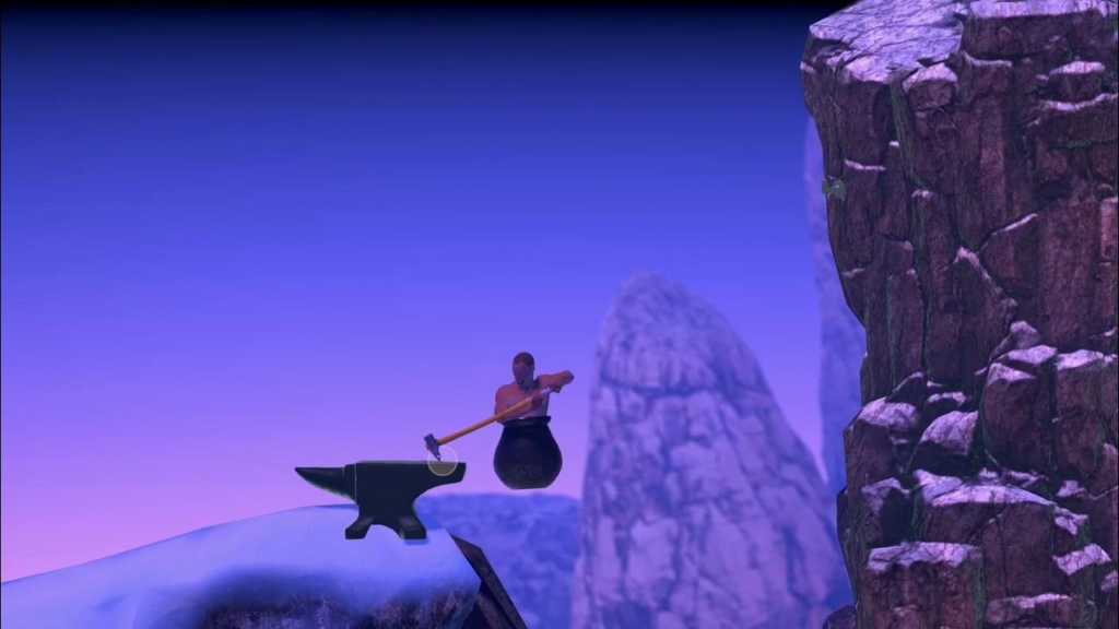
If we were to go with a mountain, the next step would be to address how to split it up into 10 “stages” in a way that would make each one visually distinct. Here’s what I came up with:
Idea: Mountain with magical/elemental properties. Frequently ascended by those seeking power/wisdom. Great for variety since you can change the element between stages to make use of many different colors and styles.
Stage 1 – Gate
Gate that serves as an entrance to the mountain. Very touristy with large crowds.
Stage 2 – Foot of the Mountain
The beginning of the mountain climb. For this point, it can just look like a normal mountain.
Stage 3 – Mountain Village
Cozy mountain village. Lodges, shops, gondolas, and various other man-made stuff.
Stage 4 – Grand Cavern
Main entrance to the cave. For now, it’ll still just look like a normal mountain cave.
Stage 5 – Mystic Hollows
The point where magic starts getting involved. From here it’s a mountain cave but with the addition of water elemental magic.
Stage 6 – Superconductor Crest
After exiting the Mystic Hollows, you reach a crest with electricity magic. Climbing further will be a direct path towards the summit.
Stage 7 – Ridge of Fire
An upwards ridge that leads towards the summit. Fire elemental magic.
Stage 8 – Chimney of Chaos
A narrow chimney of rocks. Multiple elements are present, all fighting over eachother in this small space.
Stage 9 – Pure Mana Glacier
A compact and solidified mass of magical energy. The source is from the summit.
Stage 10 – Summit of Harmony
The legendary peak of the mountain. Should look cool somehow.
While this setting did check all of my requirements, it didn’t feel very special. It didn’t feel like any of the locations said or implied anything about the game’s world at large. None of them were particularly interesting on an individual level either, where they’re basically just elemental sections of a mountain. I wasn’t satisfied with it, so I looked for more inspirations. This time I tried something different.
At around the time of me developing QP2’s theme, there was a girl that I really liked.
One of our favorite things was to just sit down and talk for hours on end, with some of our favorite topics being philosophy, religion, and spirituality. Looking back, these moments have been some of the most fun I’ve ever had. No matter how long we went on for, it somehow never got boring.
I decided to try a theme based off these conversations that I had enjoyed so much. At first I found this to be extremely cringe (and still do to some extent), but up until now I’ve taken inspiration from many things that I like, so this really isn’t that different.
The first idea when looking at the tower setting was the relationship between religions and the sky. In the majority of religions who worship gods, the gods reside above humans, looking down upon them. This idea of climbing upwards can be linked to being symbolically closer to divinity.
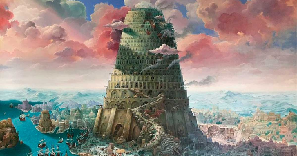
The idea of an ancient religion was also particularly fitting because of the simple nature of tetromino puzzle games. If there’s any type of video game to have an ancient history, it’s probably these. In fact, Tetris was originally inspired by pentomino puzzles (invented in 1907), which itself was built upon centuries of geometric research which can be found as early as in ancient Greek tiling. This gives a very strong starting point when it comes to writing how block stacking fits into the world’s history.
So from there I started writing the ancient society who found god-like perfection in the 7 tetrominos. What virtues would they value? What kind of symbols would they use? What would their religion look like? What kind of art would they create? Unlike with the mountain, this new setting was very exciting to flesh out.

But just having an ancient culture fleshed out wasn’t enough on it’s own. After all, I had already decided that I wanted TETR.IO to take place in a modern setting. This is where I developed the idea of a tension between powerful ancient gods and modern humans trying to harness their power without regard for their traditions and values.

From here the floors started getting easier to write. I actually wrote a bunch of concept flavor text for each floor, but none of it ever made it into the game. Here’s what they looked like:
Floor 1 – Hall of Beginnings
“A hidden underground entrance to the Zenith Hotel. Upon your first steps into the hall, your head feels lighter. Have I been here before?”
Floor 2 – The Hotel
“Travelers from across the world flock to the Zenith Hotel for it’s unmatched variety of attractions, but what are you here for?”
Floor 3 – The Casino
“Sunken heart, an empty hand, and even emptier pockets. Keep a straight face, buy in, and pray.”
Floor 4 – The Arena
“Fractured bones, head spinning, and a fading will. Keep your hands up, press forward, and pray.”
Floor 5 – The Museum
“A vast collection of ancient articles of worship and paintings from a distant era. Many of the display cases are empty.”
Floor 6 – Abandoned Offices
“Each footstep echoes throughout the empty halls. Any worthwhile information has been long since shredded. You shouldn’t be here.”
Floor 7 – The Laboratory
“Lab staff can be seen carting samples of ancient ceramics, slate, and gold. You can hear faint murmurs discussing research of the utmost importance and secrecy.”
Floor 8 – The Core
“Advanced technology is used to concentrate and contain a massive amount of energy. The source of power is unknown, but it’s presence stirs a familiar feeling.”
Floor 9 – Corruption
“Your consciousness goes numb with the screams of those who came before. Turning back has become impossible, but to go any further would be defying the heavens.”
Floor 10 – Platform of the Gods
“Unending prayers of the desperate, and the impossible obligation to all who call your name. Have you become a god? Or is it only a matter of time before you fall back down.”
Under most agreed upon definitions, these descriptions are just my unofficial word and do not count as canon. However, I do intend on having a more polished version of them in the game at some point. Once those release, they will be the official version.
Every time I had a writing session, I’d look forward to when I’d get to talk to that girl about it. This made writing especially fun since I’d also get to create good conversations with her through making an interesting world. All things considered, this made the end product much better. I’d like to explain more about why this was so helpful for me.
To anyone who has tried creating something (especially for the internet), there’s a good chance you’ll relate to me here. Whenever I try to make something for the public, I’m initially met with a great deal of confusion. How will people respond to this part? Will they notice this inconsistency? Is this even a good idea in the first place? When trying to address the vague idea of “the public”, it can easily become a losing game where nothing will ever be good enough.
On the other hand if I create for someone I know well, suddenly everything becomes clear. I can imagine the things they’d find cool, what they’d laugh at, what’d strike their curiosity. Pretty much all of my best creations were specifically for somebody. This includes things like the T-Spin guide video that I made to teach a friend or an animated scene that I drew to impress the person who was helping critique my art at the time.
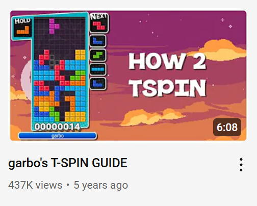
Now obviously there’s a line to be drawn here since in the end I’m still making a product for the public. I’m not gonna include something like an inside joke that only we’d understand. However, creating with somebody in mind is still a super powerful tool that I’d recommend for anyone struggling with similar creative doubts.
(also the romance subplot will continue later)
Gameplay
For the gameplay, one of the major influences was singleplayer marathon tetris games. Most modern tetris players will cringe when they hear marathon, and for good reason. Due to modern mechanics like hold, 7-Bag, lock delay, 5 previews, and uncapped handling settings, the act of stacking alone has become too easy. This has led to survival modes being impossible to balance. Once a player becomes competent at stacking, the only thing that the game can throw at them is 20g and decreased lock delay (which some find fun but most don’t).
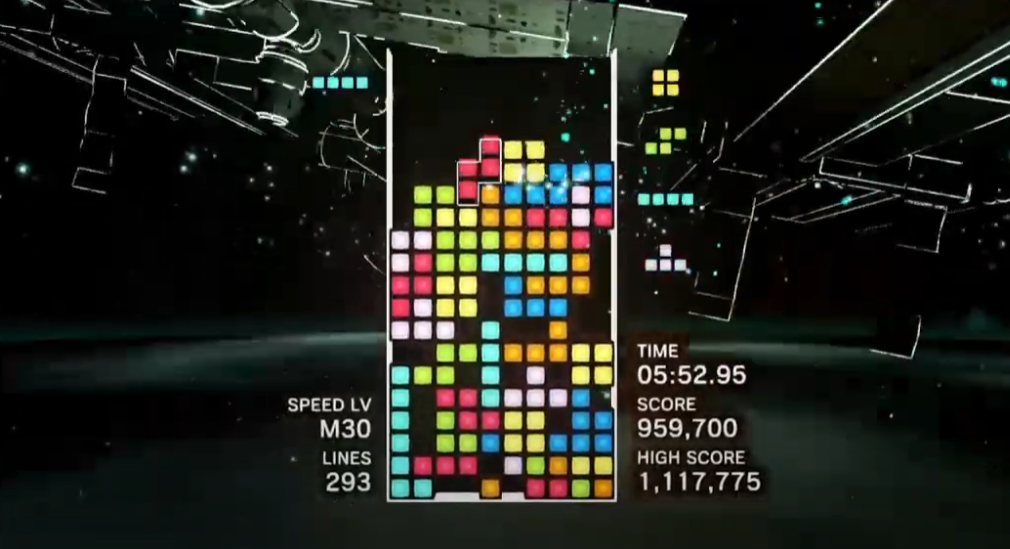
With the idea of the elevator battle set, one of my key decisions was to lean the game towards being less interactive and act as a modern take on a marathon mode. There’s a certain appeal to playing a bunch of runs and seeing how far you can get that’s present in games like NES Tetris and also appears in other genres such as roguelikes.
Another thing that inspired this direction was watching my brother play Misamino. A few years ago, I had shown my brother the Misamino client as a way to practice VS. I later found that he would spend way more time against the bot than he would against matchmade opponents.
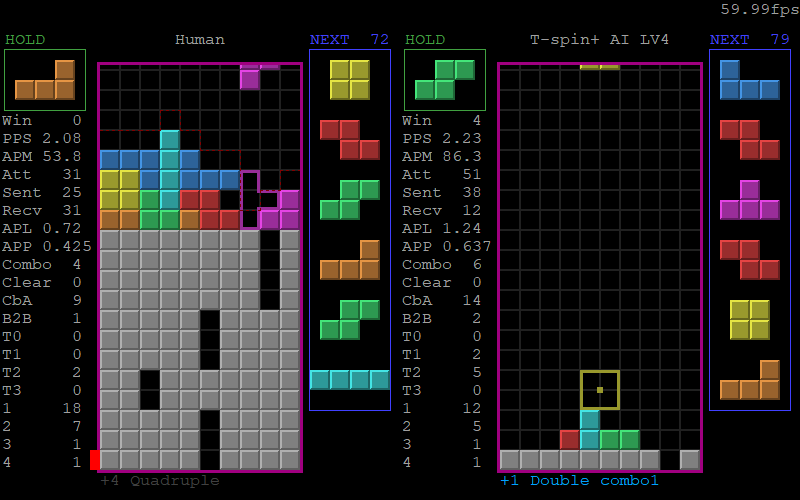
This is because he wanted to play VS tetris where you send and receive garbage, but without the stress or anxiety of being against a real person. He would also be able to pay less attention to it and play while watching streams or a video. Turns out there’s a lot of demand for the feeling of VS tetris, but in a singleplayer form.
As a starting point, I wanted to have a similar vibe to the arcade game Tetris Dekaris. In this game, clearing lines boosts you up both in the leaderboard and background. I’ve always liked games where you can watch yourself shoot up the ranking as you play (such as in osu! when you turn on personal leaderboards on a map you’ve played a lot).
Unfortunately, we weren’t able to make it quite as satisfying due to the leaderboard being other active players who are also climbing, but it’s close enough.
For the backgrounds, we couldn’t do the same thing as Dekaris since an entire 3D background would be both a nightmare for performance and also very expensive. This left us with 2D parallax backgrounds as the best option for creating depth.
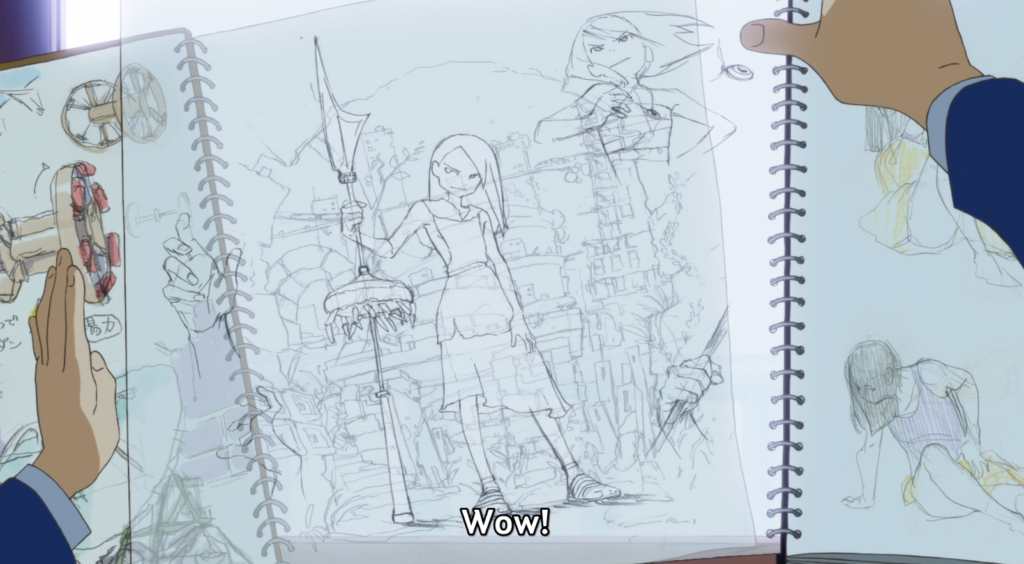
Coincidentally, I was rewatching the anime Keep your Hands Off Eizouken! (which is one of my favorites) and I noticed a really cool parallax composition in the first episode:
When I saw this, I immediately went back, paused, and started imagining how it’d look in TETR.IO with a board in the center.
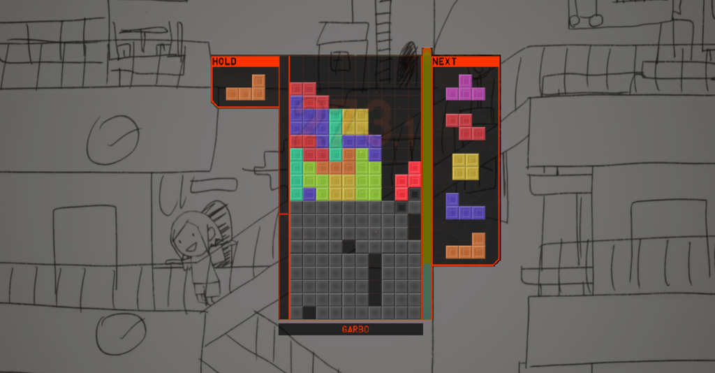
Something about how the sides framed the board in the middle and how the staircases added diagonal lines across a background of horizontal lines felt like a perfect match for QP2. From there, I tried copying these parts of the composition to test them out, and these tests later became the original sketches for The Hotel.
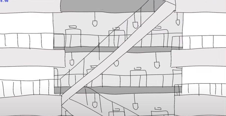
My sketches weren’t originally going to be used for the final versions so closely but in order to make the process smoother for the artists, I ended up drawing the compositions for all 10. With this in mind, I tried to build on this foundation and create new ideas with the same principles. For example, some of them use diagonal lines in different positions, use arches, have thinner or thicker “walls” on the sides, etc. It ended up being an amazing starting point, and I sometimes wonder how different the tower would look like had I not randomly decided to rewatch Eizouken.
Funny sidenote: Later in the first episode, two of the characters go up to a window and overlap their art to see how they’d look together, which is basically exactly what I did with the TETR.IO board LOL. Coincidences are scary.
Spectating
Since QP2’s gameplay was taking a more singleplayer approach, the problem becomes how we make the tower feel more lively. This was a big recurring complaint during playtesting, where players found the game to feel too isolated.
Back in 2023, popular League of Legends streamer Dantes hosted a big race for the first person to reach challenger in the new season. As someone playing along at home, I noticed that it created an incredibly fun environment compared to my usual solo queue grinds.
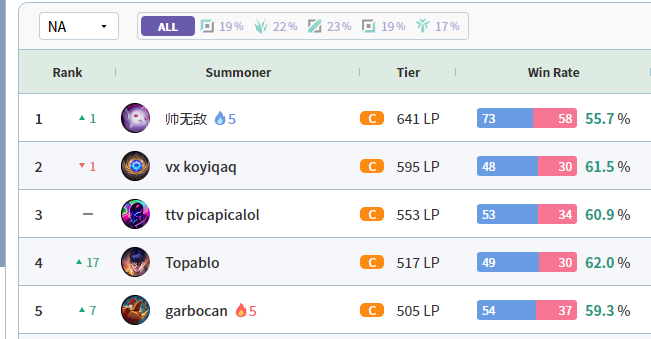
Because of the big event, almost every high elo game would have at least 1 streamer. This meant that between each of my games, I’d be able to channel surf and see how everyone else’s games were going. As a player, the normally isolating solo queue experience was brought alive by an active social space between games.
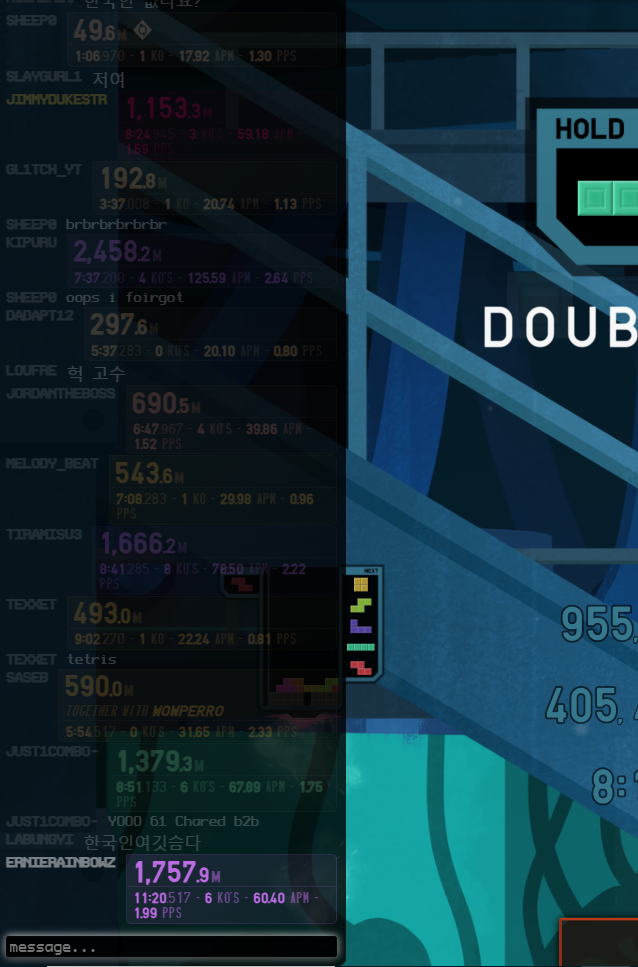
With QP2, I wanted to focus in on the time inbetween games. It’s common for players to want a break after going full speed for 9 minutes straight, so this was a good opportunity for a social component like spectating or hanging out in the chat.
I also want to talk about one of my less good decisions when designing quickplay. In order to promote chatting between games, I designed the “send to chat” feature which sends a summary of your run to the chat. In theory, this was supposed to make the game feel more social. In practice, it’s just too easy to just hit the button after every run and not think about it too much.
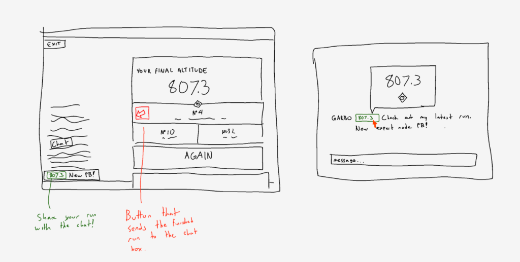
Some features from the sketches that didn’t make it into the final version might have made a difference (specifically adding a comment before sending and the more compact summaries). Despite this, it’s still one of the less important features and wasn’t prioritized during the important weeks leading up to release. The job is definitely not done here, and there’s still room to improve the QP2 social experience at some point.
Mods
With the base tower done, I wanted a way to scale difficulty for the pros with a relatively low development cost. I started with the idea of making an extra scaling difficulty mode with a new debuff added with each level. This is a common mechanic in roguelike games such as Slay the Spire’s Ascension levels or Balatro’s Stakes.
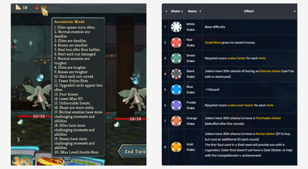
The issue is that this kind of difficulty scaling works best when there’s a way of “beating the game” as opposed to QP2’s high-score approach. Reaching a high altitude on ascension 14/20 would be pretty meaningless, as the only scores that people would care about are either 0/20 or 20/20. This is why it made a lot more sense to just have “Normal” and “Expert” modes instead of difficulty levels.
At around the time when I was working on difficulty scaling, a new YouTube video from my favorite The Battle Cats youtuber was uploaded. While watching it, I got an idea.
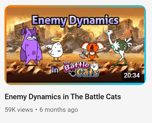
In this video, Canned Juice explains how different enemies in a battle cats stage will influence eachother and combine to create unique dynamics. While these were things I already understood as a battle cats player, hearing it explained made me consider difficulty scaling from a new angle.
If I changed the linearly stacking debuff levels into their own individual mods, I could then create a bunch of sub-challenges, each with their own leaderboards for replayability. This time I paid attention to how mods can cover for each other’s weaknesses and create many new challenges through different combinations. For example:
- Allspin + Messier. The Allspin penalty makes comboing much less viable, which is the easiest method of downstacking messy garbage.
- Volatile + Double Hole. Volatile garbage can be tanked to receive large amounts of clean garbage, but Double Hole instead makes it extremely punishing to accept any lines.
- Gravity + Invisible. Invisible has your pieces briefly revealed every 5 seconds, which means that under normal circumstances you can wait until the next reveal if you lost track. Gravity makes it much more difficult to stall by forcing your pieces down faster.
With this, we were able to add a lot of replayability and achievements for elite-level players with a comparatively low development cost.
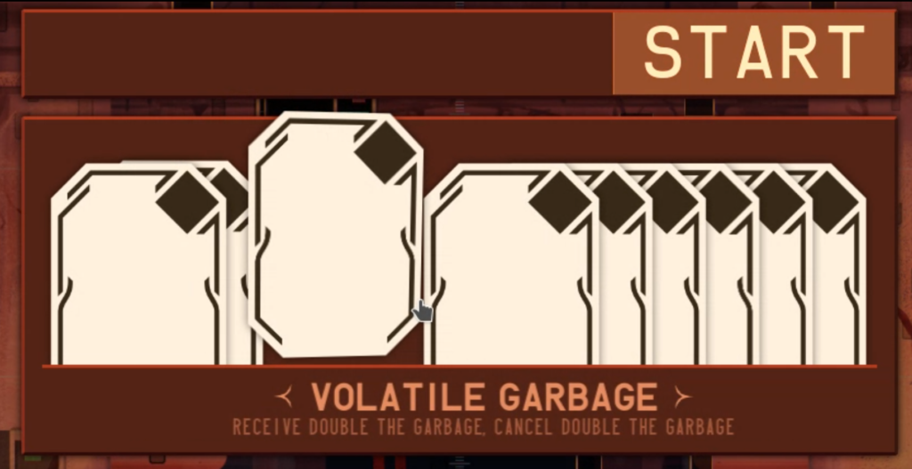
In the beginning, mods weren’t going to be styled at all. This was until I came up with a way to tie them to QP2’s overall theme. On the surface, the tarot cards can be read as drawing a fortune for your next run, which is true. However, tarot cards are also commonly associated with new-age spirituality where individuals take pieces of old religions to form their own personal belief system. This happened to fit surprisingly well with some of the tower’s themes.
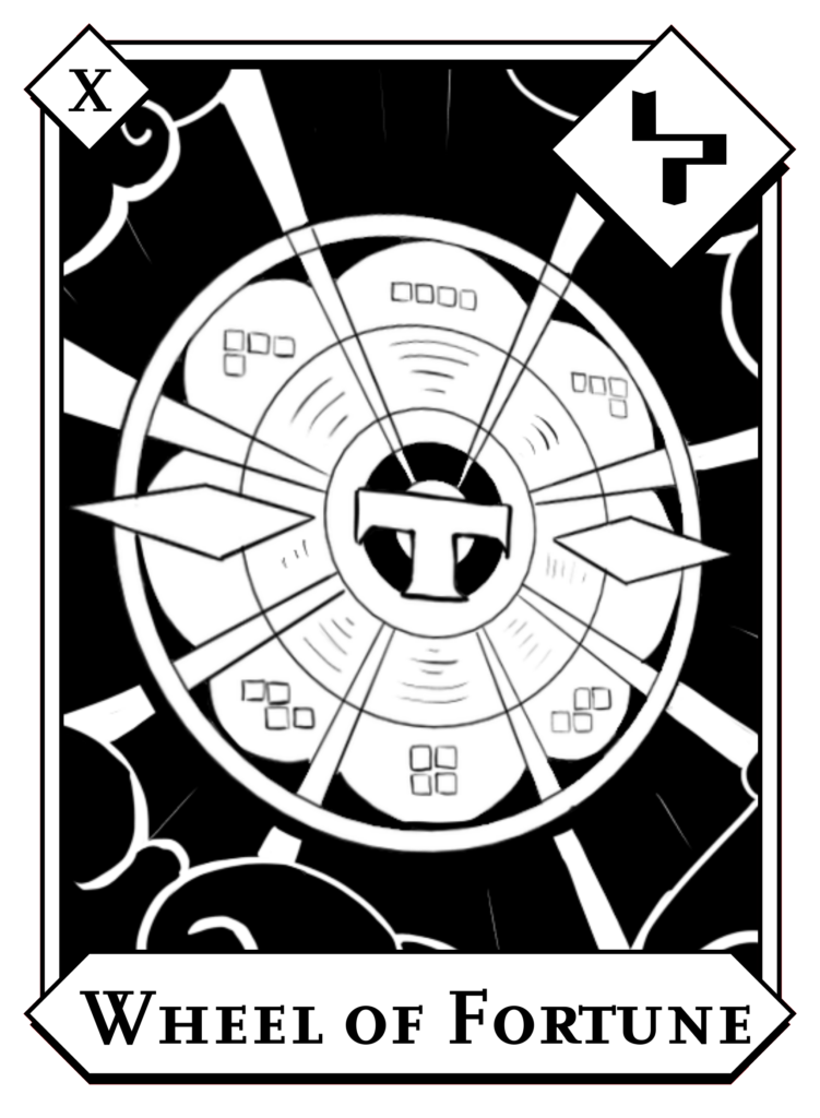
The cards use symbolism from ancient religion, but aren’t a part of the tradition themselves. This adds another perspective on the tension between modern humans and ancient gods. Is it an insult to adapt old traditions and symbols in a modern way?
Lastly, I want to talk about duo. Remember that girl that I mentioned earlier? At this point, things had progressed and we were now trying to see if a relationship could work. We had talked a lot about the worldbuilding and writing of QP2 over the past few months, but the problem is that she doesn’t play tetris and wouldn’t be able to experience much of the tower. At that moment I had an idea, so I told her that I’d figure something out.
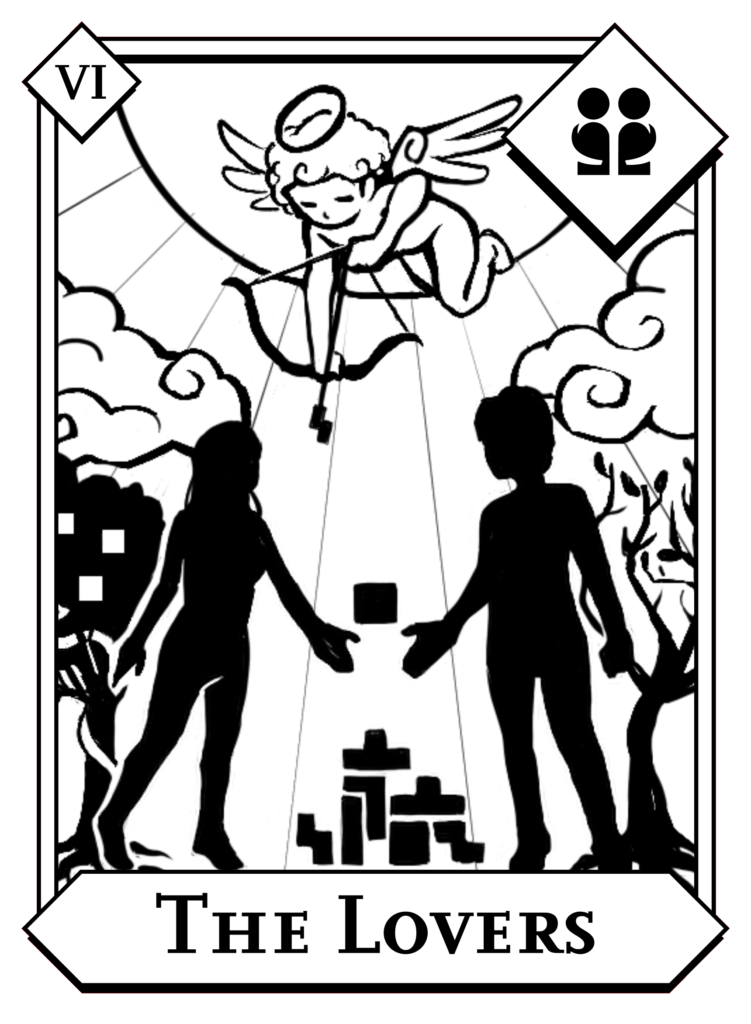
Another funny origin story is how the revive prompt system was made. There were a few times when she had watched me play TETR.IO, and she’d always be curious about the different spins and tech that I’d do. When it came to designing revivals, the original thought was that it’d be more fun for her if she got to see some cool tech while being revived. Of course I made sure that the revive system was good for everyone else too, but yeah that’s how it started LOL.
As for where we are now, it’s a long story. The tl;dr is that things ended between us shortly before QP2’s launch, and we never got to play it together.
Closing Thoughts
In the end, I’m very happy with how QP2 turned out. It’s fun to look back and remember the stories behind every decision and how they combine bits of so many things I like. However as I mentioned in the other post, this is only the beginning. I have big plans for where we’re going to take TETR.IO next, and I’ll continue to pour inspiration from everything I’ve enjoyed into the game.
Anyways thanks for reading!
If you want to ask me any questions about the contents of these articles, you can join my recently re-opened discord server.
lasix diuretic over the counter
lasix diuretic over the counter
Heard about zzzzbetapp from a mate. Gave it a spin and gotta say, not bad at all! Easy to use and the odds were pretty decent. Worth checking out if you’re looking for a new spot to place your bets. zzzzbetapp
Heard about 123win44 lately. It does not waste my time at all. Place a bet there and the money is yours. Don’t waste your time anymore. Come here with me! 123win44
Heard some good things about 181bet4. Gonna give it a whirl tonight and see if it lives up to the hype! Wish me luck! Check it out for yourself here: 181bet4
888betslogin, nice and easy login I hope! Gonna scope it out and see if I can win something. 888betslogin
850betvip, huh? VIP treatment sounds good to me. Let’s see what they’ve got to offer. 850betvip
Hmm, 789banca…Looks interesting. I’m always on the lookout for new places to play. Worth a look! 789banca
doryx 75 mg
doryx 75 mg
buy antibiotics for sinus
buy antibiotics for sinus
diflucan 150 mg over the counter
diflucan 150 mg over the counter
linezolid cost us
linezolid cost us
metoclopramide 10mg
metoclopramide 10mg
Castle APK makes it easy to enjoy online entertainment. The Castle app download allows users to access movies and series instantly. Castle APK download is fast and simple. Castle download works smoothly, while Castel APK provides a great viewing experience.
atorvastatin 10 mg tablet
atorvastatin 10 mg tablet
Why the hell are the comments filled with spam bots
[5221]Tsars Casino Philippines: Secure Login, Easy Register & Best Slots Online. Download the Tsars App for Exclusive Casino Bonuses. Join Tsars Casino Philippines! Secure Tsars casino login & easy Tsars casino register. Play top Tsars slots online and get the Tsars app download for exclusive Tsars casino bonuses today. visit: Tsars
Trying my luck at 718betwin. The odds seem fair, and the selection’s not bad either. Fingers crossed for some wins! Hop on over to 718betwin.
Gave 02game a shot. Website looks clean and modern. Signup was easy and quick. I’d say that it’s one to watch for the future. Take a look at 02game
Futurolacasino, huh? Gave it a try last week. The sign-up bonus was pretty sweet. Won a few bucks on blackjack. Could use a better loyalty program, though. Definitely worth a look at futurolacasino
Just tried out umcassino1 and, not gonna lie, I was impressed. The graphics were slick, and the gameplay was smooth. Definitely worth a spin if you’re searching for a fresh spot to play. Here’s the link: umcassino1.
Just logged into evotaya777casinologin and everything went smooth. Seems legit, worth a look for the login experience alone. You can check it out here: evotaya777casinologin
5hbetcom is fire! Been playin’ here for a minute now. They have all the games I want, plus some I’ve never seen before. Give it a shot and see what you think, you might like it. It’s here: 5hbetcom
CC6 Online Casino Philippines: Experience top CC6 slot games. Quick CC6 login, easy register, and CC6 app download for premium gaming and big wins today! Join CC6 Online Casino Philippines today! Quick CC6 login and easy CC6 register to enjoy premium CC6 slot games. Secure CC6 app download for big wins on the go! visit: cc6
Solid article! Thinking about bankroll management & adapting to opponents is key in tournaments. Seeing platforms like jilibbb bet games cater to local preferences with 24/7 support is smart – accessibility matters! Good read.
phtaya https://www.rephtaya.org
noblejili https://www.hannoblejili.net
ph143 https://www.allph143.org
like777 https://www.itlike777.net
i’ve kinda imagined that the TETR.IO gameplay takes place either on the buttons of an elevator or in the elevator physically.
188bet250 is a name I’ve seen around. Supposedly decent odds and a good selection of sports. Gonna give it a proper look this weekend. See the action at 188bet250
Hey guys! Heard about uuddbet? Been checking it out myself. Seems like they’ve got some good odds going on. Might give it a shot, what do you think? Check it out here: uuddbet
Hey! 3rrcom is the site. Let’s see what it offers. I have high hopes because I haven’t been disappointed to date Let’s see with this! This is the link: 3rrcom
Alright, ready to spin some slots? 888slotbet looks like a place to do it. Let’s hope for some big wins! Check it out here: 888slotbet
Great insights on immersive gaming-really highlights the thrill of live dealer play. For a seamless, secure experience, check out PH987 casino. Definitely worth a spin!
This is such a cool read and it’s eyeopening how much thought and inspiration goes into what seems like a “simple” Tetris mode.
my personal favorite part of QP2 is the tarot card designs. from what i’ve gathered, tarot cards are usually “medieval-looking” nowadays, and i really like the angular/modern/magic game kind of look that the QP2 tarot cards have
That was an awesome csgo stream 😂
We wouldn’t have qp2 without that girl LOL
this is a fact that i have to live with every day for the rest of my life
Can’t believe that qp2 was one idea away from being a mountain
It’s a shame that you couldn’t go through what you’ve made with someone who was a huge inspiration to what became. I’m sure though that someone who was apart of something such as this will have at least a little curiousity and tried it out themselves and for me that would make me feel better.
I used to be one of those people that used to think that not everything needs a theme/story like you mentioned in the osk blog. But after reading all this and even just a little critical thinking, I realise now that without it everything is simply just shallow.
Even without realising, QP2.0 has its own distinct character making it that bit more memorable. I think that all this will change the way that I think of games and game creation.
Yeah the part about having a distinct character and being more memorable is particularly important when it comes to making a polished game.
Words like “lore” and “story” sometimes get a bad rep amongst gamers because of it feeling forced upon them. Obviously this would include things like an unskippable cutscene, but it also includes more subtle stuff like the feeling of missing out by not paying attention or caring as much for reading text.
While there is lore and story in TETR.IO, the main thing that I like to focus on is “flavor”. My personal definition for flavor is the intersection between game mechanics and subtext. For a solid example of this, let’s use Minecraft (hopefully you’re familiar LOL).
In Minecraft, some igloos spawn with a secret basement under the carpet. Inside the basement, you’ll find brewing equipment, a zombie villager behind bars, and the ingredients to cure them. Even though Minecraft isn’t a game with a stated story or lore, this area was still built with a lot of intent. Who used to live here? Were they experimenting on ways to cure the zombie infection? Why did they need to hide it in a secret basement? While I wouldn’t exactly call this story-rich, I’d describe it as flavorful.
Flavor is a great way of making themes and worldbuilding memorable without it feeling forced or overbearing. For that reason, it’s been my preferred method for players to interact with the world so far in TETR.IO.
Null’s Brawl to ciekawa wersja gry dla fanów mobilnej rozrywki. Nul Brawl oraz Null Brawl oferują odblokowane postacie, dodatkowe skórki i więcej możliwości. Nulls Brawl iOS działa płynnie na iPhone i iPad, zapewniając szybkie mecze oraz interesującą zabawę dla każdego gracza.